Jan Tschichold: The New Typography
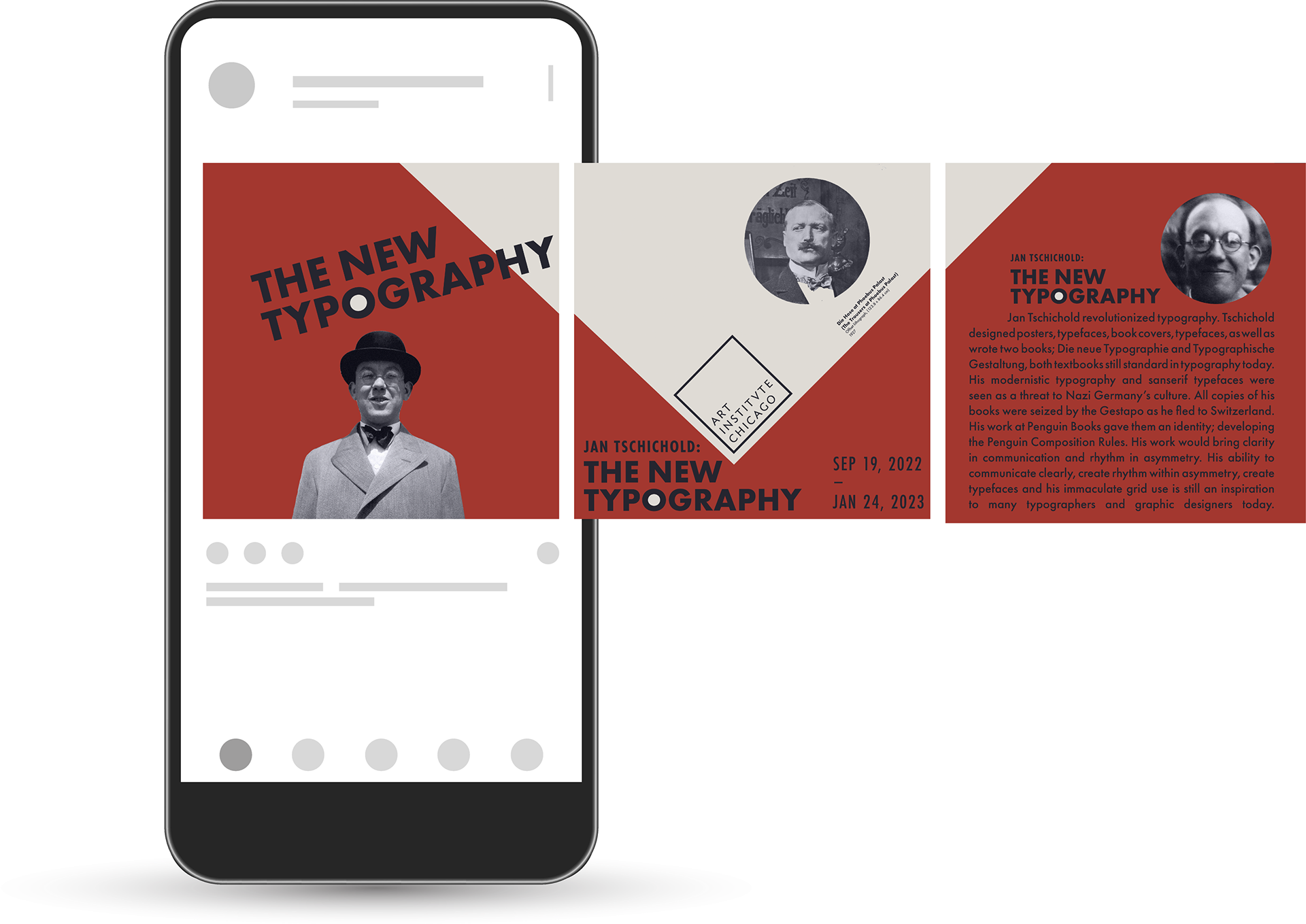
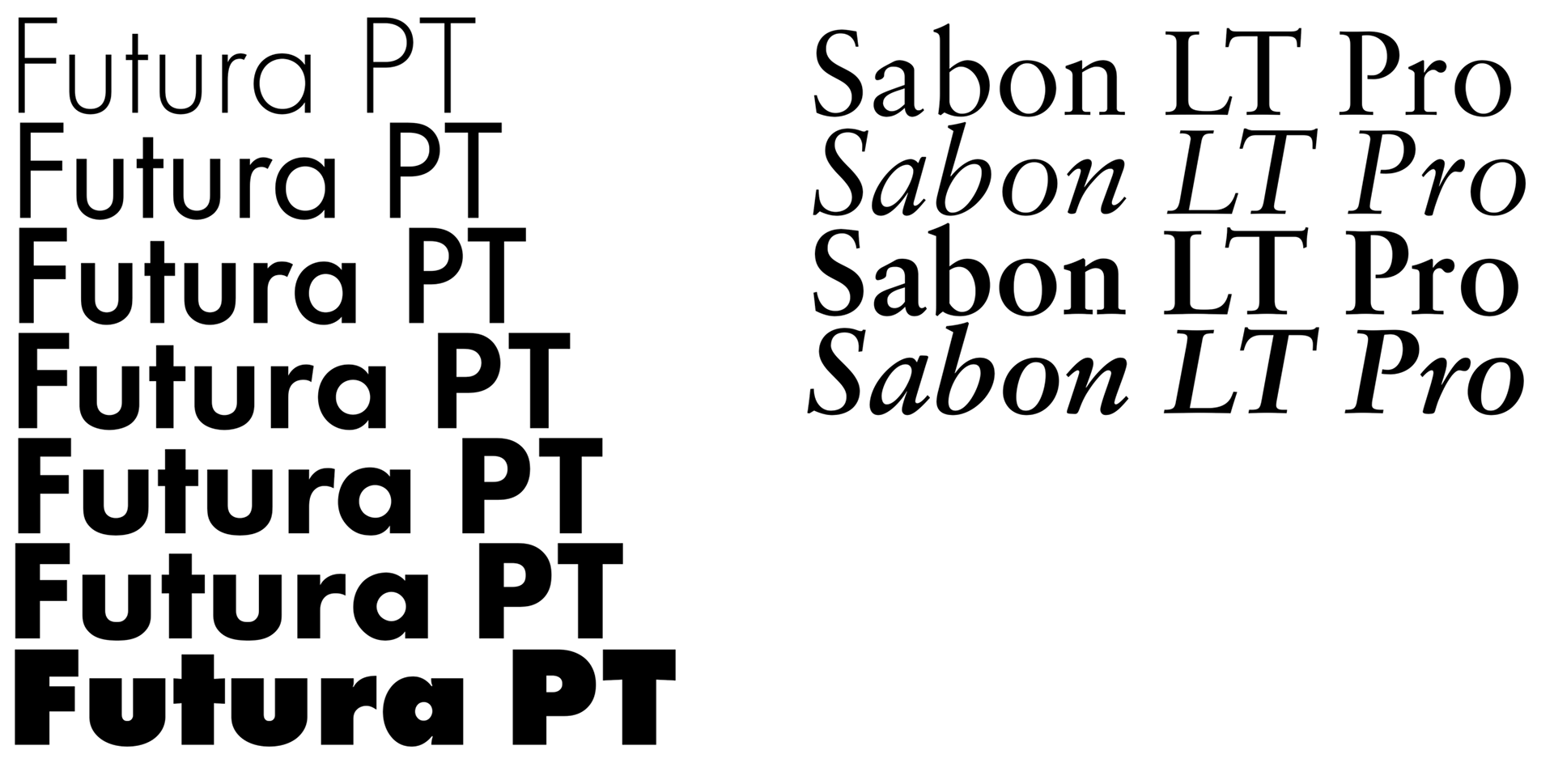
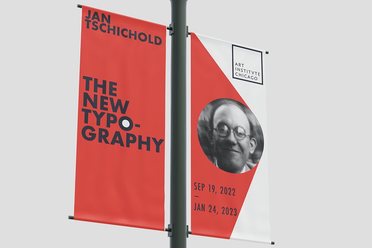
As a graphic design student tasked with creating marketing materials for a fictional upcoming exhibition featuring the works of Jan Tschichold, I turned to his own designs for inspiration. Drawing upon Tschichold’s expertise in poster design, I recreated his style while incorporating key details about the exhibition. The exhibition itself is aptly named after one of Tschichold’s renowned books, “The New Typography”, and my primary goal was to pay homage to his masterful use of text placement. By using his signature typeface for the body text in the accompanying booklet, I sought to create a cohesive aesthetic that would highlight the importance of his contributions to the field. Ultimately, I aimed to promote the exhibition in a way that was both visually striking and true to Tschichold’s legacy. I believe that through careful consideration of his design principles, I was able to effectively draw attention to the exhibit and create a cohesive, engaging experience for visitors.
Ideation:
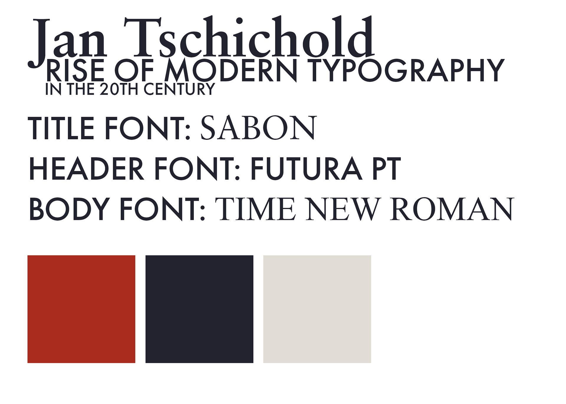
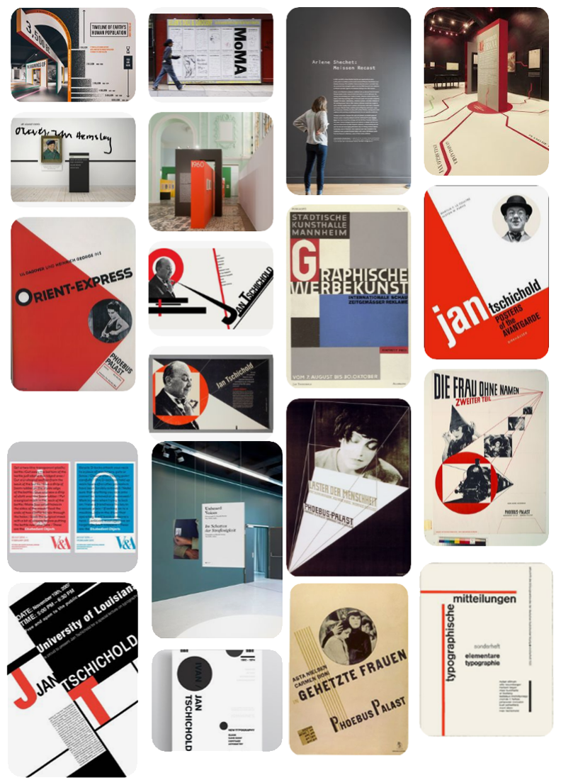
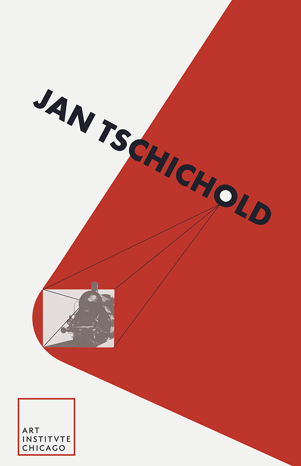
When researching and ideating for the project I wanted to encapsulate the style of Jan Tschichold, taking inspiration from his many works, his use of color, and his innovative grids.
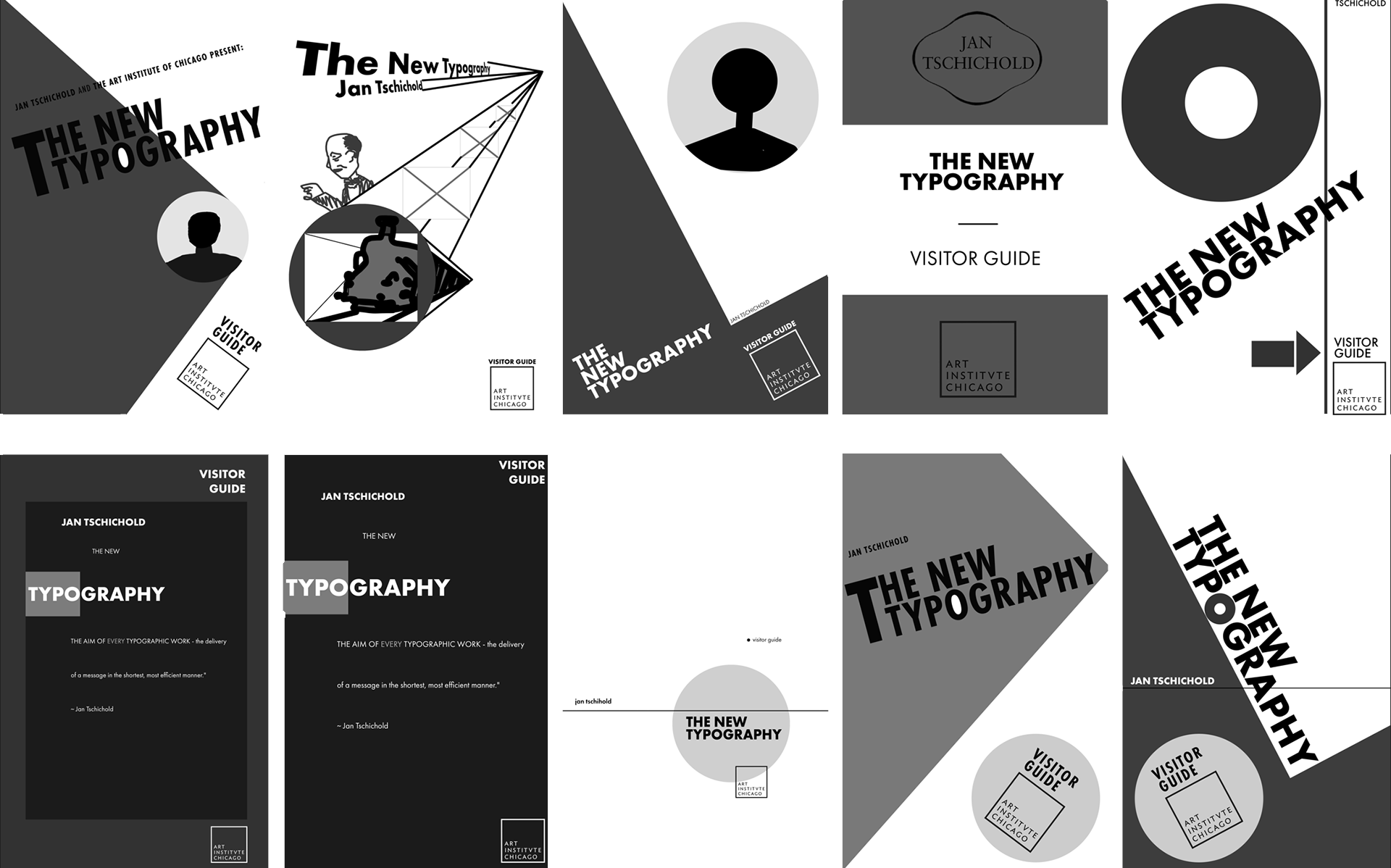
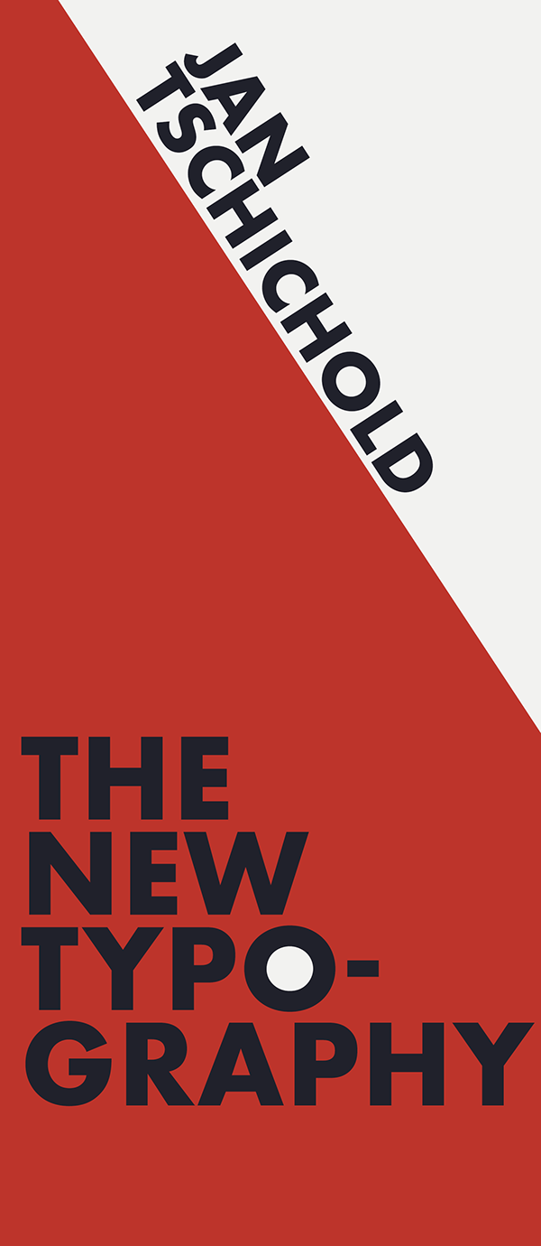
Visitor Guide Drafts:
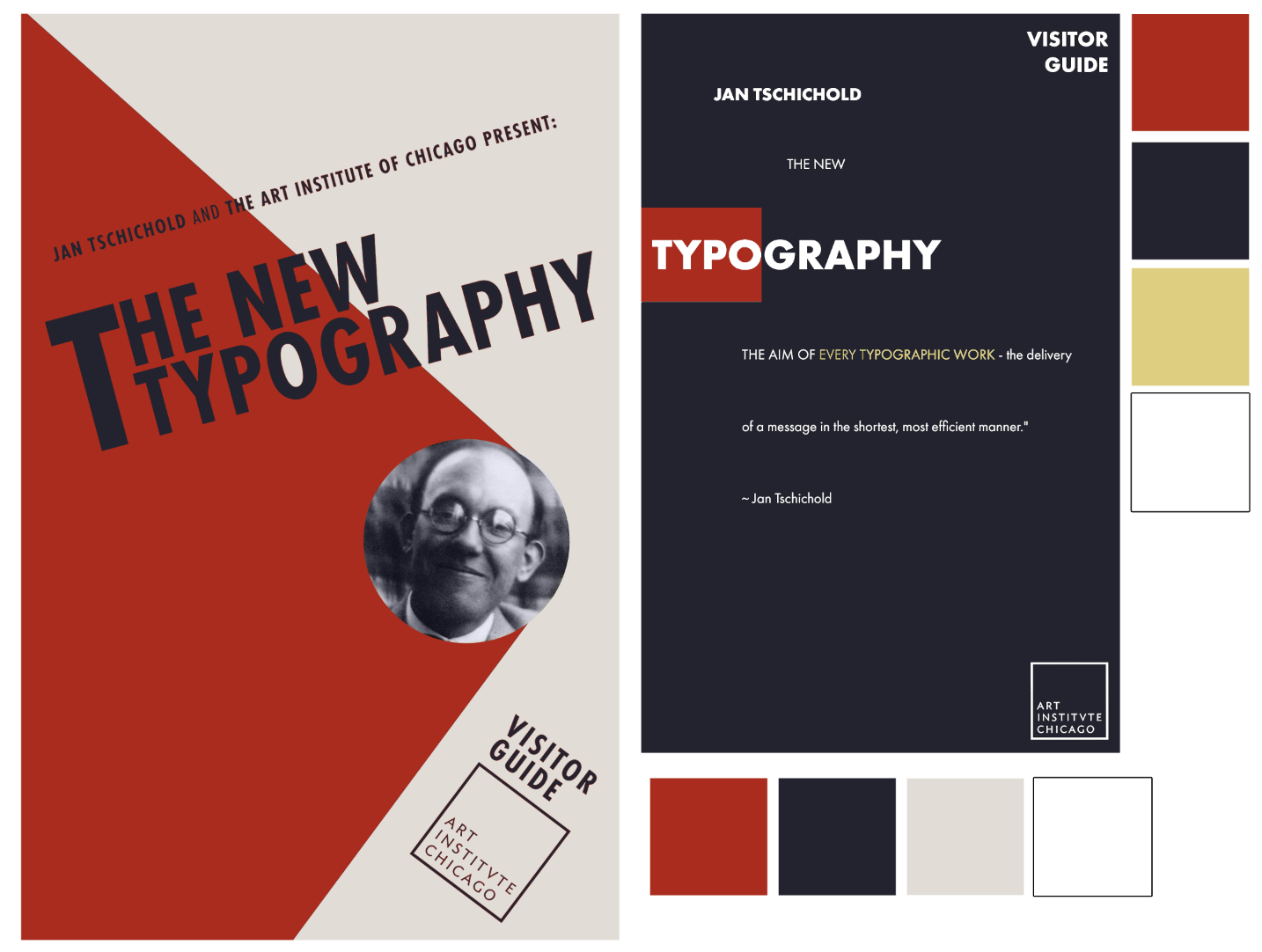
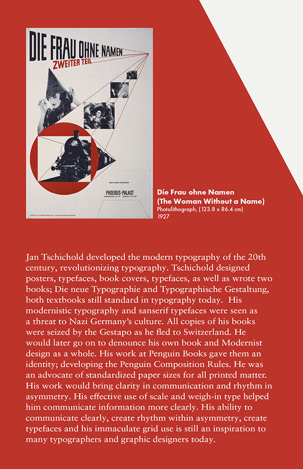
When designing drafts for the visitor guide I took inspiration from Orient-Express at Phoebus Palast (Left) and Jan Tschichold's book The New Typography which the exhibition is named after.
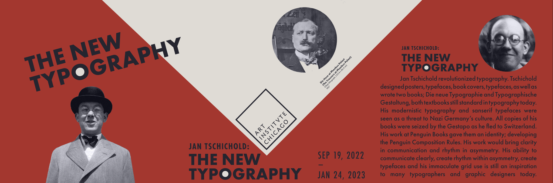
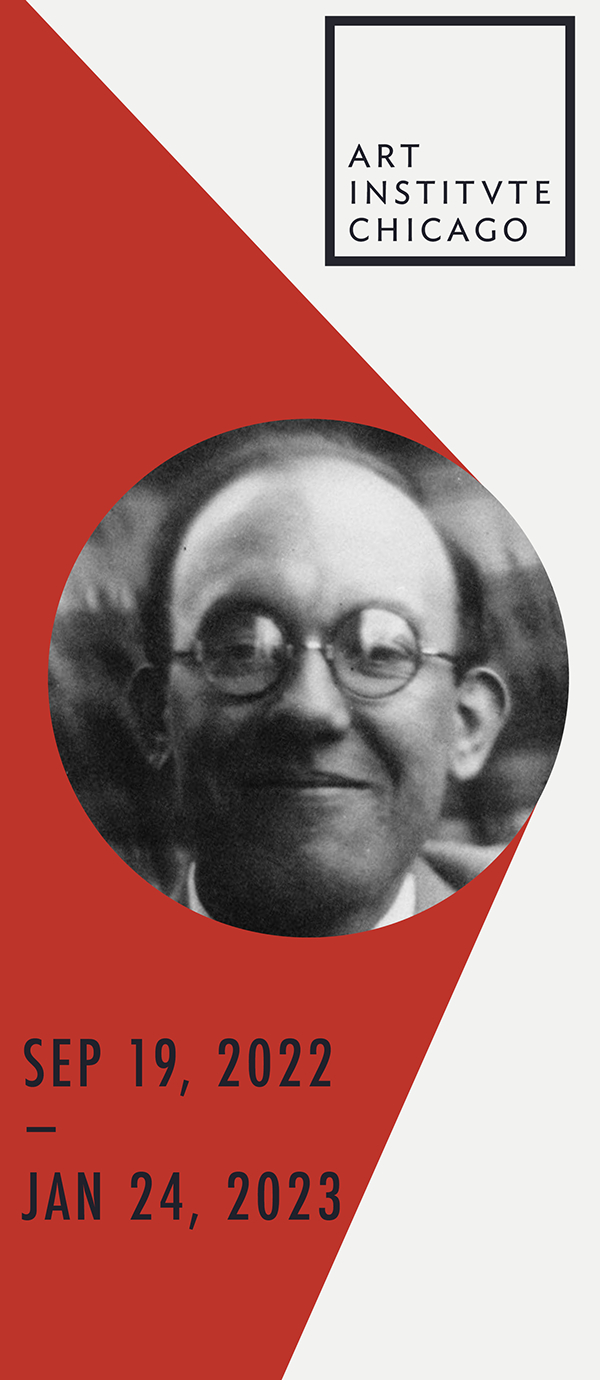
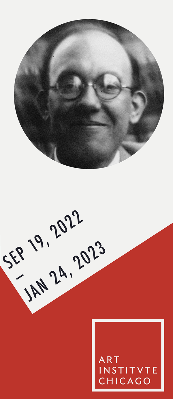
Final Visitor Guide:
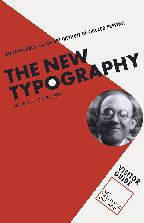
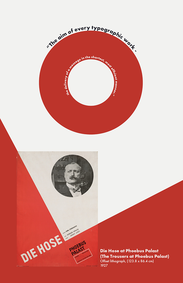
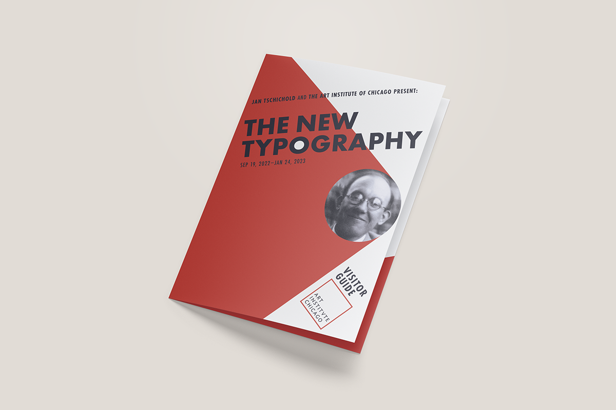
The visitor guide was designed with Jan Tschichold's color pallet and grids in mind. Taking inspiration from his poster for Die Hose (the Trousers) at Phoebus Palast (Poster for the film directed by Hans Behrendt, based on the play by Carl Sternheim), and Orient-Express at Phoebus Palast (Poster for the film directed by Wilhelm Thiele)
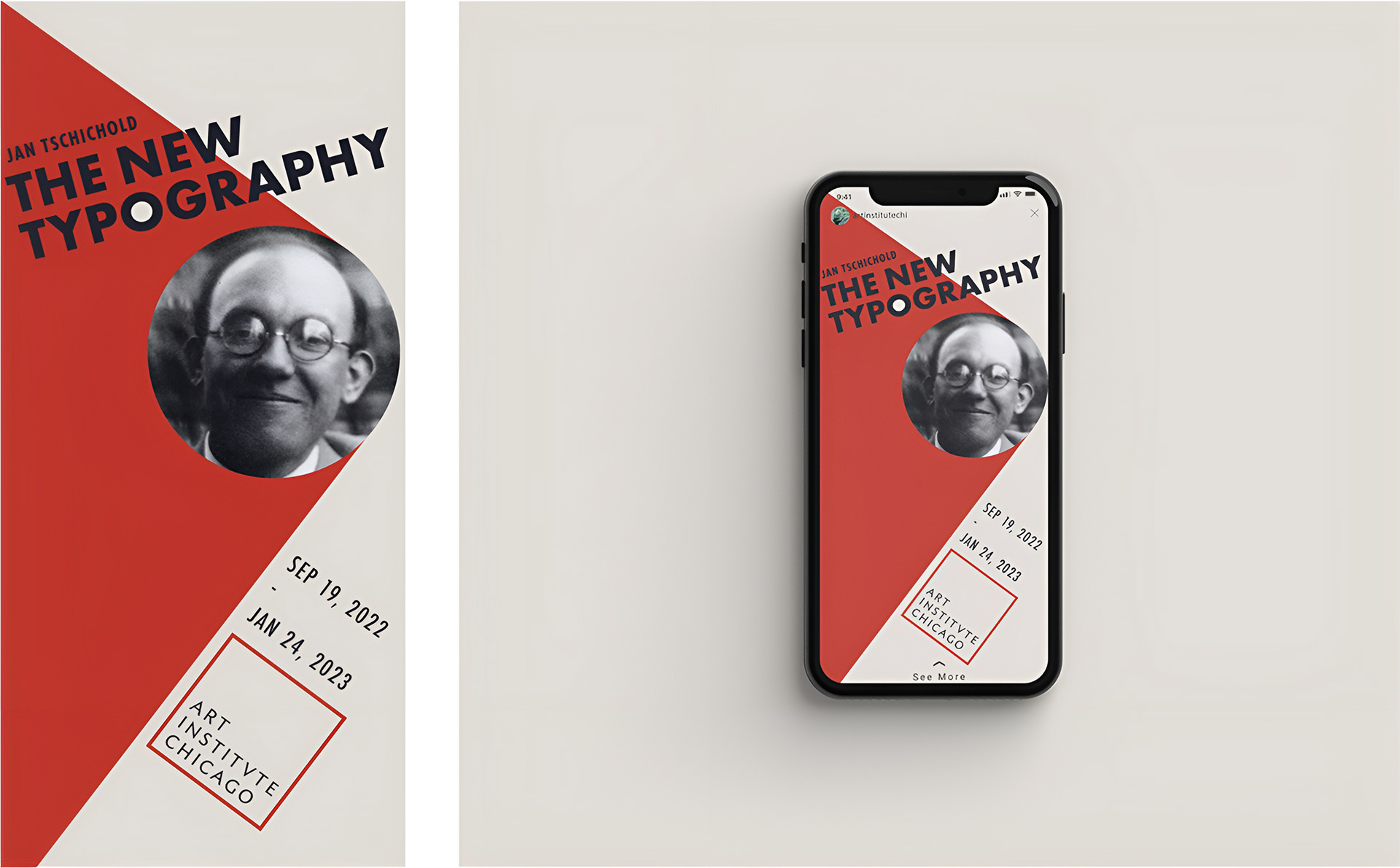
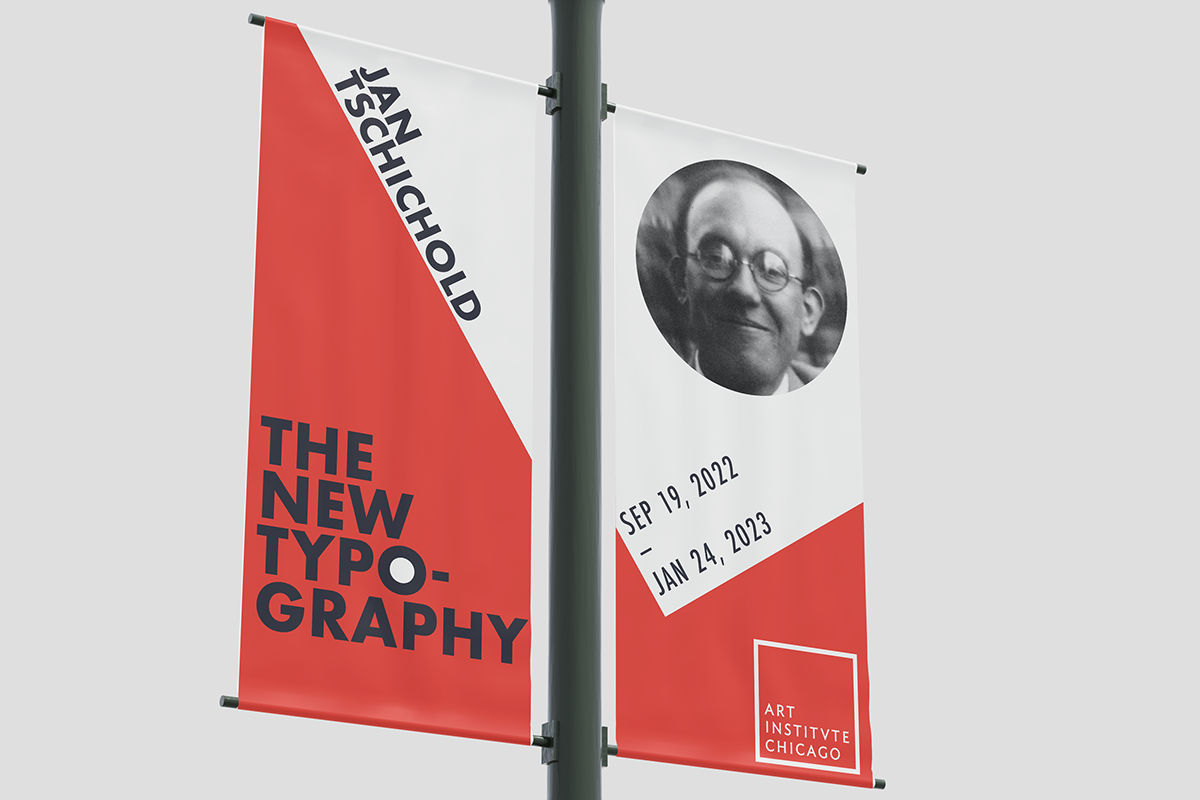
Banners:
Soial Media Post: